Yes, I am a huge Polaroid geek. And I am also a typography geek, so I need no excuse to offer up a little celebration of Polaroid’s longtime logo typeface: News Gothic.
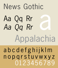
It was created by the great type designer Morris Fuller Benton in 1908 for ATF, and its clean crisp lines were probably most popular in the mid-century modern era, before Helvetica swamped the design world. I happen to like it better than Helvetica: the lowercase, especially, looks more graceful to me, and the slightly narrowed letters mean you can fit more text on a line. Here’s the sample provided by Wikipedia:
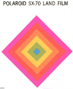
When Paul Giambarba used it for Polaroid’s new logo in 1957, he chose it, he says, because it was “the only decent sans-serif face available to us at the time.” (In that predigital era, a font was a big expensive pile of steel matrices and lead slugs, and designers had far fewer faces available than your average Macintosh now offers.) It was a vast improvement on the messed-up Memphis logo that preceded it, that’s for sure. Bill Field, the master of Polaroid’s design work in the 1960s and early 1970s, used News Gothic in a thousand ways, and, with help from Giambarba, made it a central part of the SX-70 product identity.
For some reason, though, the lettering that’s front-and-center on the SX-70 camera itself is Helvetica. That’s a weird choice, since it was so prominent, and I think I know why. Field often battled small fiefdoms within Polaroid that didn’t want to give up nonstandard letterheads and the like, and I suspect that’s what happened here.
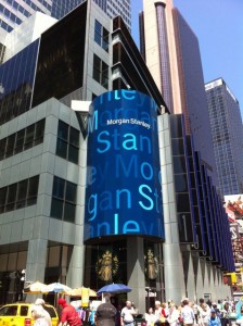
News Gothic is once again somewhat fashionable, after a couple of decades under the radar. It’s in the logotype of Morgan Stanley, seen here in Times Square:
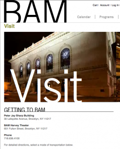
 And in Michael Bierut’s visual identity for the Brooklyn Academy of Music, seen here on BAM’s Website:
And it lingers on the façade of St. Vincent’s Hospital, recently closed, in Greenwich Village:

And shows up on the covers of two albums by Patti Smith, one of which has a title that I suspect is no coincidence:
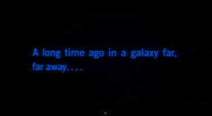
And let us not forget maybe the most visible moment News Gothic ever had, when it appeared on movie screens in 1977 (and forever after):
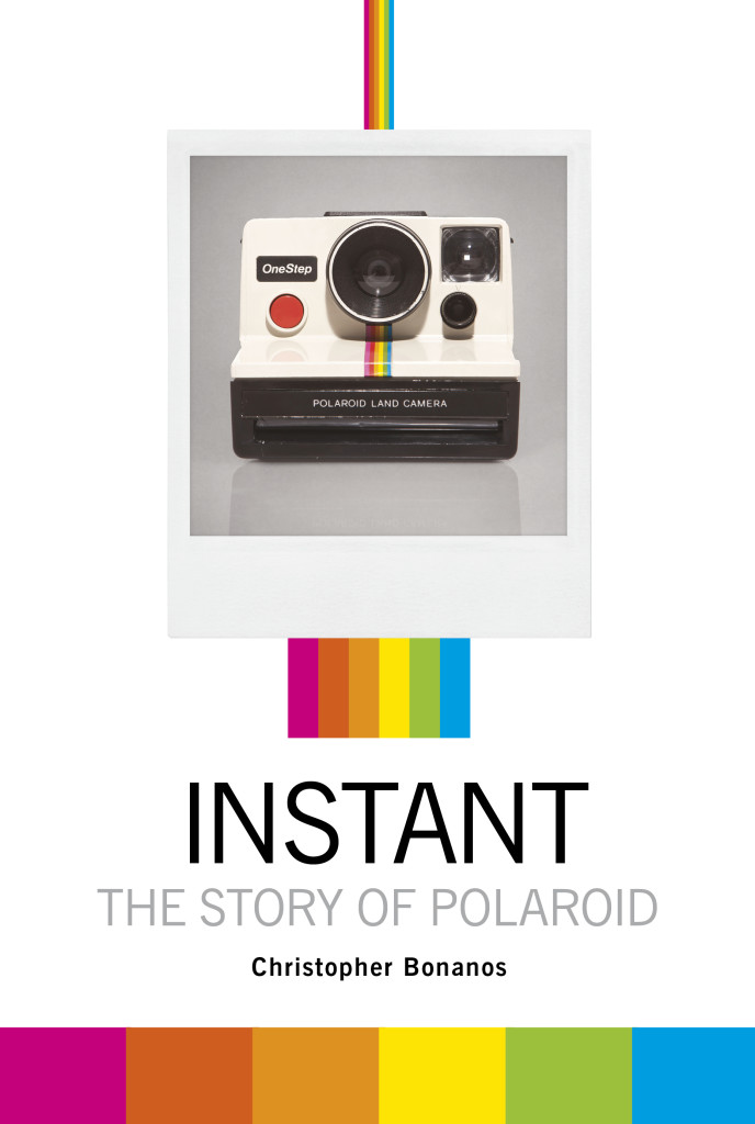
Plus, of course, it appears in the logotype at the top of this very Web page. It has a significant presence in my book, too (visuals to be revealed shortly).
Polaroid’s designers slowly evolved away from News Gothic in the late seventies, first for more Helvetica and eventually for a new custom logo whose typeface is unclear. It’s custom-drawn, maybe (according to some online speculation) based on a typeface called Frutiger.
 It’s not bad, either, but the old one still looks cooler to me.
One Response to Instant Artifact: News Gothic
Leave a ReplyCancel reply
LEGALITIES
This site is not connected with or endorsed by Polaroid or PLR IP Holdings, owners of the Polaroid trademark.ON TWITTER
My TweetsBlogroll
- 'Insisting on the Impossible'
- Everything Reminds Me of You
- Flickr's Polaroid group
- Instant Options
- LandCameras.com
- Paul Giambarba: Analog Photography At Its Best
- Paul Giambarba: The Branding of Polaroid
- Polaroid
- Polaroid SF
- Rare Medium
- The Impossible Project
- The Land List
- The New55 Project
- Vintage Instant








I share your affection for the News Gothic font and the way it was used by Polaroid. I remember walking past–and frequenting–a photo supply place on the main drag where I went to college. They had the most beautiful, minimal sign in the window: black gloss plexiglass with the simple image: POLAROID, in News Gothic, in the rainbow font. It was simply elegant. In the late 1970’s, everyone who was at least 20 years old was familiar with Polaroid cameras, as we had all grown up with them. I knew a guy who worked at that camera place–I graduated high school with him–and asked if I could buy the sign if they ever ‘retired’ it. Well, the blender of college and time sent everyone in all directions. I never got that sign, but it was beautiful–and the font is still iconic.